[untitled] chicken mixtape
Project Overview
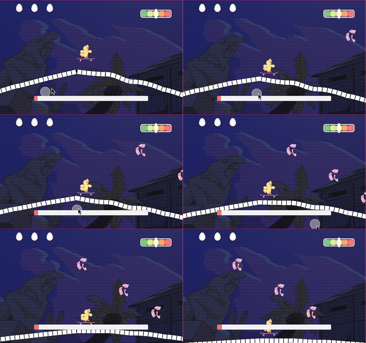
[untitled] chicken mixtape is a project that I created with a team of 8 other members for the 2024 GMTK game jam. It is a 2D game that allows users to interact with the level's music EQ. The player's goal is to keep the chicken safe from obstacles while skating on terrain that fluctuates based on the music frequency.
The theme of the game jam was scale. Our project fits this theme because players are able to dynamically scale the level's music EQ.
The Process: Screens
Brainstorming the Gameplay:
Implementation:


We spent the first few hours deciding on what kind of game we wanted to build. The theme (scale) was oddly simple, yet very open-ended so we had a lot of possibilities. We were torn between a 2D platformer that took place on one end of a seesaw and one that utilized music frequency. Ultimately, we chose the latter.
Brainstorming the Home Screen:

As the team's UI/UX designer, I came up with a few ideas for the main menu that matched our gameplay. All decisions were made as a team together, through majority vote. The most popular option was #1 and #2.
#1 was a good option if we kept our game simple with little information-- just two buttons, one to play the game and one to customize the settings.
#2 was a good option if we wanted to include more information, such as developer credits and the soundtracks for each level.
Prototyping : option # 1

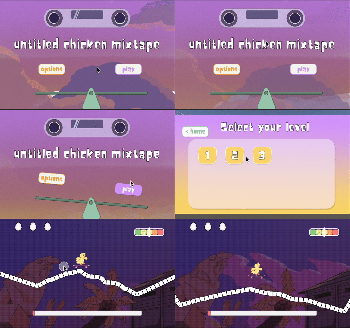
main menu screen


clicking on either button results in the seesaw tilting towards that direction
Prototyping : option # 2

each button click has a unique pitch
All designs were created on Figma, which was frequently accessed by the whole team to vote on.
Ultimately, we chose option #1 for the game. I also implemented the design in Unity using C# due to time constraints, and this was when I felt the "designer vs engineer meme" moment...just kidding! I had a lot of fun throughout the whole game jam.
Implementation
mid fidelity
final
Navigation Screens:


The Process: Features
Brainstorming the Health Status:

I ideated a few designs for the player's health bar.
The second option was a creative twist on the gameplay's focus on music. Each barline would count as one "life", and a music note would drop each time the player bumped into an obstacle.
The third option was a continuation of the seesaw from the home screen, in which the obstacle that the player failed to avoid, would weigh down the other side of the seesaw.
The team's favorite was option #2, and I turned to Figma to create a few versions:
Initial Designs:


Unfortunately, we felt that the designs didn't quite match the rest of the aesthetic that the game had so far. Additionally, we agreed that the UI should be minimal due to our fluctuating terrain taking up most of the screen space.
We did not have enough time to implement these designs in Unity. I came up with a simpler design to combat the problem:
Final Design:

It was the classic, hearts health system, but with eggs instead. Instead of the initial 5, the player would only get 3 chances to redeem themself after hitting an obstacle before the game ended.
Each time the player bumped into an obstacle, the egg would crack.

Acceleration Speedometer:
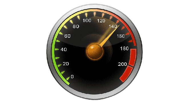
The duration of the player's key press is the amount of acceleration. To visualize this, the game needed some form of speedometer / accelerometer that displayed the acceleration in real-time.
Instead of the classic speedometer (left) style, we wanted something sleek and simple, a design that matched the game's soft aesthetic:

option #1

option #2

option #3
The Finished Product
You can play the game here!
Overall, I learned that UI / UX is not about what I think is best for the game or the player. It's about listening to others and accomodating to specific requirements of the product.
I had a lot of fun meeting new people and working in a larger team setting! You can check out the music playlist made by the team's wonderful music/sound designers here.


